Button Icons Shifting Up In Simulator

I’m following along with Brian’s How-To videos and I’m having a strange problem with the Up/Down/Left/Right navigation buttons on the remote. Everything looks fine in the design layout but when I run the simulator the top rows shift up leaving a gap between the Left/Enter/Right buttons and the Down buttons. Since I can’t see the grid in the simulator I don’t know if it’s the grid that is shifting up or the icon images.
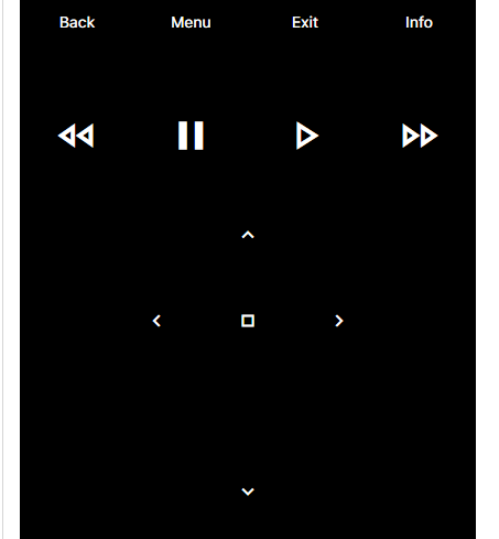
Screen Shot 2022-06-02 at 1.39.26 PM

I’ve gone through and reset everything I could think of to default but that didn’t help. Any guidance on what to do next would be much appreciated.

EDIT: I loaded the HRP file onto my iPhone X and it has the same gap so it’s something with my layout, not the simulator itself.

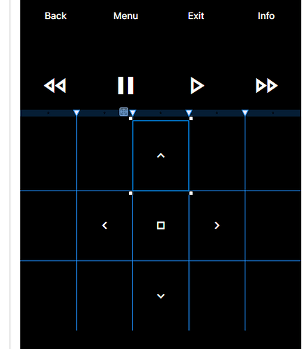
Here’s what it looks like in design layout:

You need to closely inspect the Grid.Row & Grid.Column on every control. You likely have one of those set to a value that’s out of range. For example, maybe you’ve only defined 4 RowDefinitions but you have an element with a Grid.Row of 4. That’s an out of range value because these are index based. 3 would be the max value you can have if you’ve only defined 4 RowDefinitions. If I were to guess, that is might be your issue here, hard to say though.

Dang It. That’s exactly what it was. The bottom (down) control had a Grid.Row of 3 with only 3 RowDefinitions.

THANK YOU!

I have a lot to learn.

2 Likes