I have expand/collapse functionality implemented that works perfectly in the simulator but crashes any device I try to run it on. I think I’ve narrowed the issue down to the StackPanel I’m using and guessing I’m not using it the way it was intended, so hoping for some advice on other approaches I might be able to try to achieve this effect…
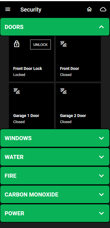
I have the StackPanel at the top level set to fill the full screen. Within that, I have a collection of grids and each grid has two rows. The first row contains a button that spans the width of the screen with an expand/collapse icon on it and the second row contains a device browser.
I have triggers in place so that when one of the buttons is clicked, the visibility of the corresponding device browser is set to true and all others are set to false. Essentially this results in the appearance of an expand/collapse capability where only one section can be visible at a time.
When I publish this to a device, the page loads up with all of the sections “collapsed” but as soon as I click on one to expand it, the app crashes.
If the StackPanel cannot be used in this way, is there another approach I could take to implement something similar?
Here’s an example of what it looks like in the simulator with the first section expanded: