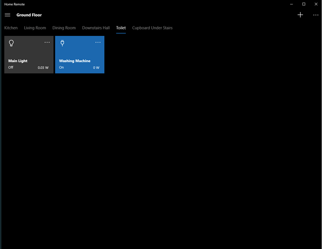
Groups tile layout

When using the built in groups functionality, is it possible to have any influence over how the tiles are laid out?

At the moment it’s dynamic and seems to build from the center of the screen outwards horizontally, then upwards.

If possible I’d prefer that to start from top left as I think that would look better when there’s less controls in a group. At the moment you end up with them in the middle of the screen.

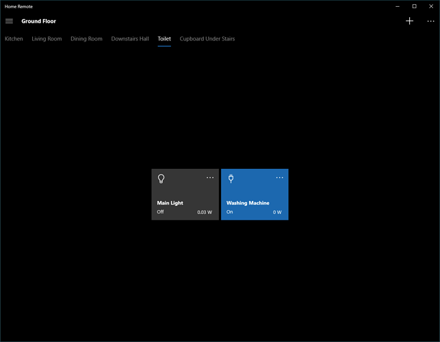
For me this would look better like:

Not currently using the built-in group pages. You’d have to create your own pages. You could do so with a single TabbedPage & a bunch of ContentPages containing a DeviceBrowser. On the DeviceBrowser, set the HorizontalContentAlignment to Left & VerticalContentAlignment to Top.

Thanks for the quick reply.

That’s a shame as groups let you get up and running pretty quickly rather than having to construct pages manually.

Any chance of a feature request for some point in the future to allow the start position to be set?

Yes. It can certainly be added as a feature. I was simply stating as it currently is today that’s what you’d have to do. I went ahead & moved this to “Feature Requests”

Thanks Bill, that’s great.