Hi
So I am using Imperihome currently and building my replacement Home Remote slowly.
In Imperihome I had my own set of custom icons for widgets aka tiles.
I haven’t fully decided if I want to go this route with Home Remote or keep it simple with the default simple looking icons.
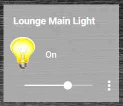
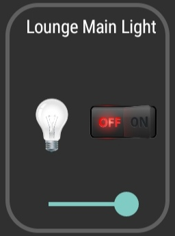
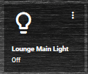
Here is what my Lounge Main Light tile looks like in Imperihome:
ON:
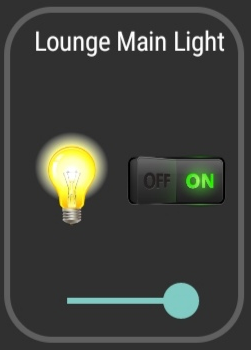
OFF:
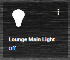
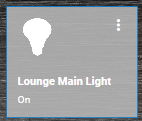
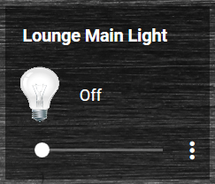
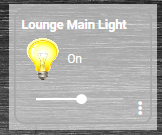
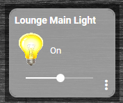
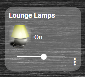
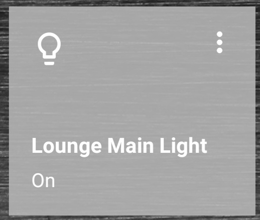
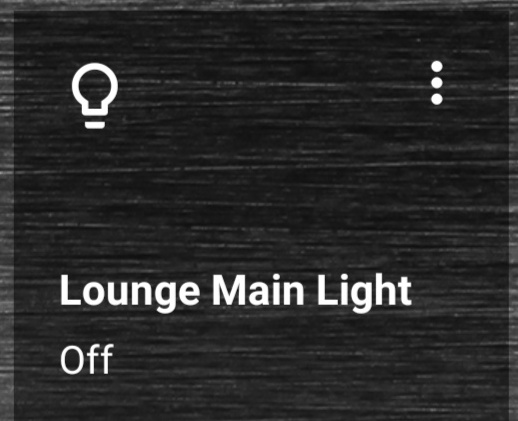
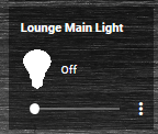
And this is how it currently looks in the Home Remote:
ON:
OFF:
I like that the Imperihome tile has a dimmer slider right on the tile, in Home Remote I don’t and I have to click the 3 dots to get to the dimmer. Is it possible to add a dimmer slider on to the tile?
EDIT:
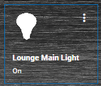
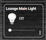
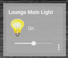
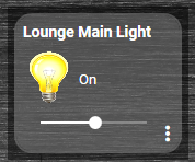
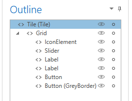
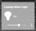
I copied the “Slider” from the LightDetails.xaml file to my custom tile and I now have a working dimmer slider.
Alternative layout looking a little more like the Imperihome widget.
I like that the icon is bigger in Imperihome and also changes the icon for the ON / OFF states.
The ON / OFF button on the Imperihome tile looks good but its kinda small on my phone screen and tricky to press correctly with fat fingers sometimes.
I like that the Home Remote tile you can click it anywhere to turn ON / OFF the light.
So pros and cons to both.
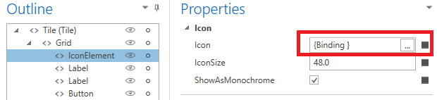
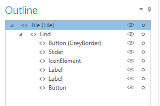
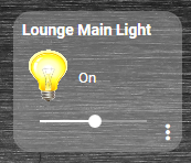
I have made a copy of the DimmerTile.xaml file for experimenting with.
I see I can make the icon bigger by changing the IconSize on the IconElement, I like the bigger looking icon.
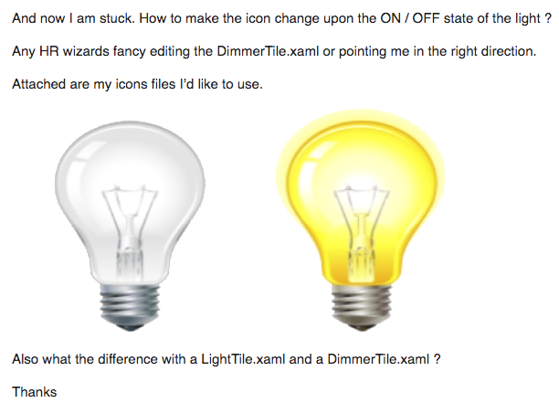
And now I am stuck. How to make the icon change upon the ON / OFF state of the light ?
Any HR wizards fancy editing the DimmerTile.xaml or pointing me in the right direction.
Attached are my icons files I’d like to use.


Also what the difference with a LightTile.xaml and a DimmerTile.xaml ?
Thanks