I think at this point I’m mostly done (although we never truly stop tinkering) and wanted to post up some screenshots of what I’ve managed to accomplish in THR Designer. I took a ton of inspiration from the forum for a lot of my ideas, so I wanted to take the time to thank those that have posted up some really excellent design work.
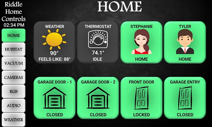
The Home screen. Pretty straight forward, nothing too terribly fancy. Just reading Hubitat info for the dynamic tiles. The bottom row turns red upon an open event and the presence sensors for me and my wife go gray upon an away trigger.
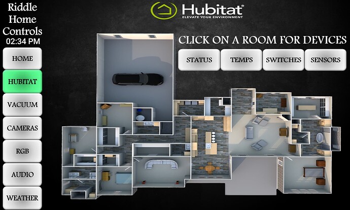
Main Hubitat page. This is where I spent the bulk majority of my time. Built a model using Sweet Home 3D and layered invisible buttons over the zones that upon clicking take you to all of the devices in that zone.
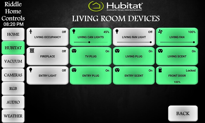
An example of what a typical page looks like clicking on the Living Room area of the map.
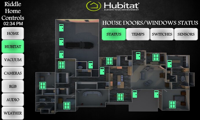
Clicking on Status will show the current status of all of my doors/windows contacts. I’m using Envisalink that feeds the contact info into NodeRed, which I’m then using to update virtual switches in Hubitat (and do loads of logic in NodeRed, but that’s an entirely separate topic of discussion). Green is closed, the icon in Red is open (none open in this particular photo, probably should’ve opened a door to show that).
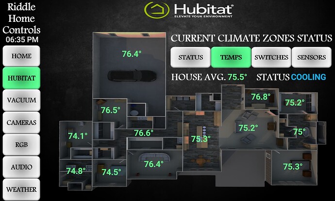
Temperature page overlay. I control my thermostat off of logic that I feed into NodeRed from quite a few sensors around the house. This gives me an idea of what each temperature “zone” looks like. I did manage to catch it running last night (it was hot in my neck of the woods yesterday), so you can see the updated text to cooling. I also have states for heating (red) and idle (green).
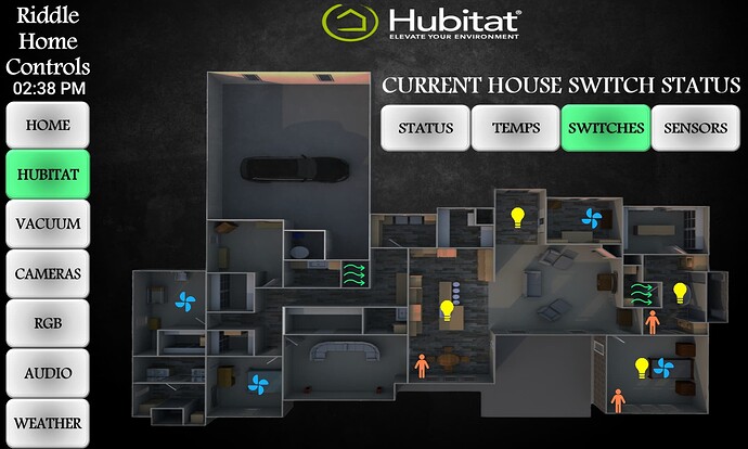
Switches page just gives me a quick glance of the various states of devices in any given room, be that occupancy, lights, fans, vents, fireplace, etc. Clicking on any switch will take you to that room’s device page.
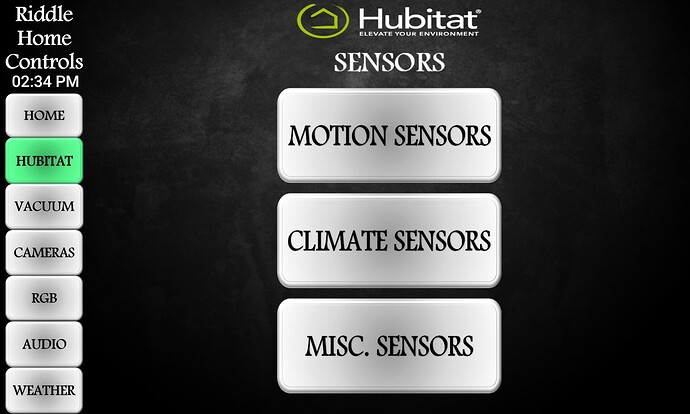
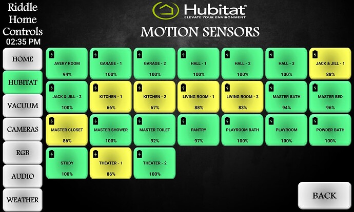
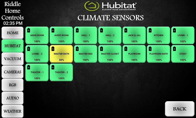
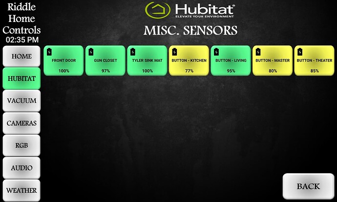
Clicking on Sensors from the main Hubitat page brings me to this page, which just lets me take a quick glance at battery life of my various battery powered devices.
Using RegEx to change the colors of the buttons. I think anything registering below 20% reads red, but I’d have to double check that.
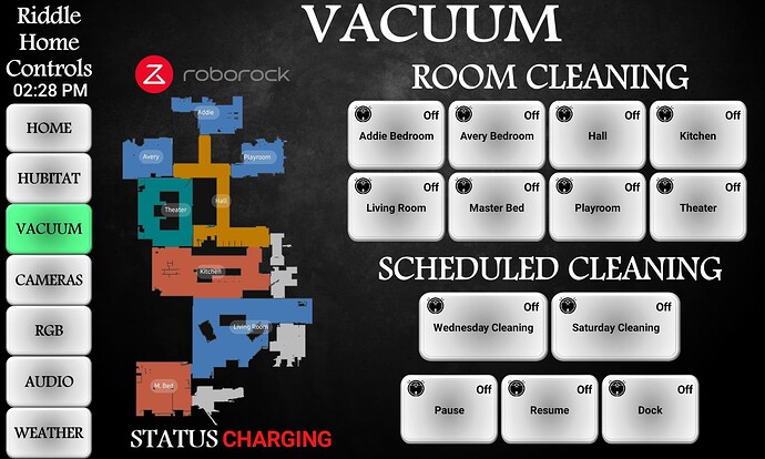
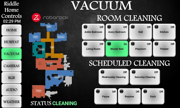
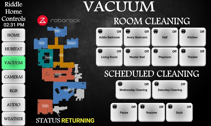
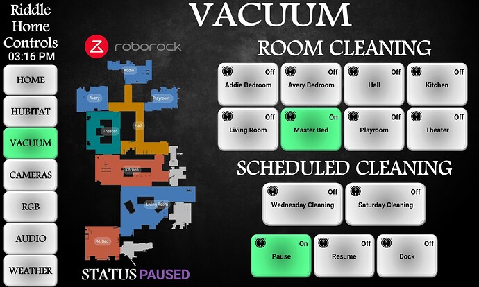
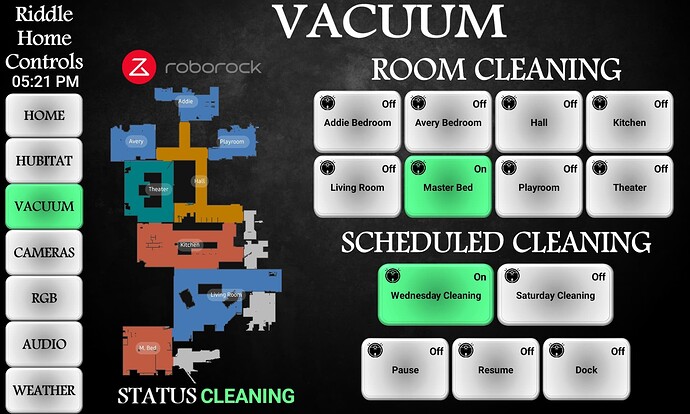
Some various shots of my vacuum page. Since yesterday was one of my schedule days that I built out for it in NodeRed, I went ahead and captured how it looked on-screen. All of my vacuum logic is done via NodeRed and Hubitat virtual switches as well.
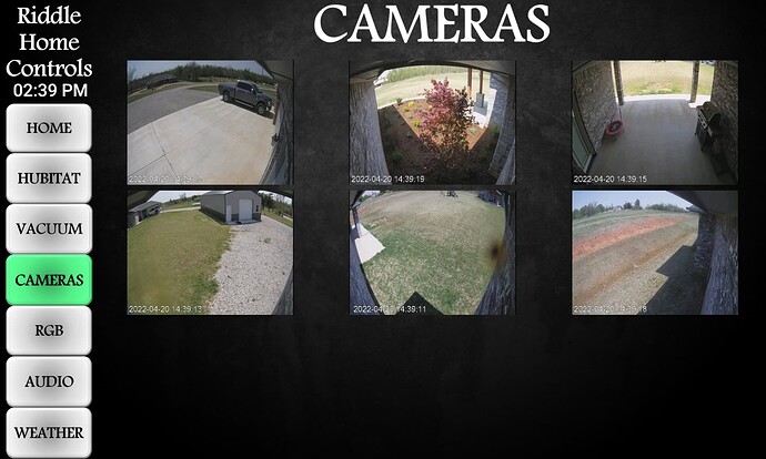
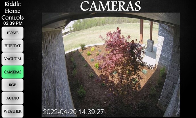
Rather straight forward camera page with a popup for each camera for a larger image. Yes, I need to clean my cameras.
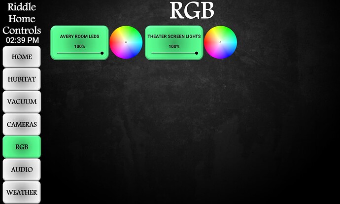
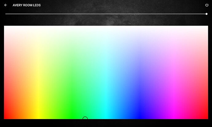
RGB Page and the template I made for the devices. Pretty bare right now, but ready for expansion once I get the time to start adding some RGB lighting elsewhere. I use Shelly RGBW devices controlled via Hubitat/NodeRed.
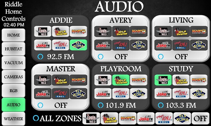
My Audio page that took me way longer to complete than I’d like to admit. I run a HTD Lync 6 system, and at first was working on a plugin to control it, then realized that 95+% of the time we utilize the echo devices tied into the system, so I went with a dashboard radio approach. Works great.
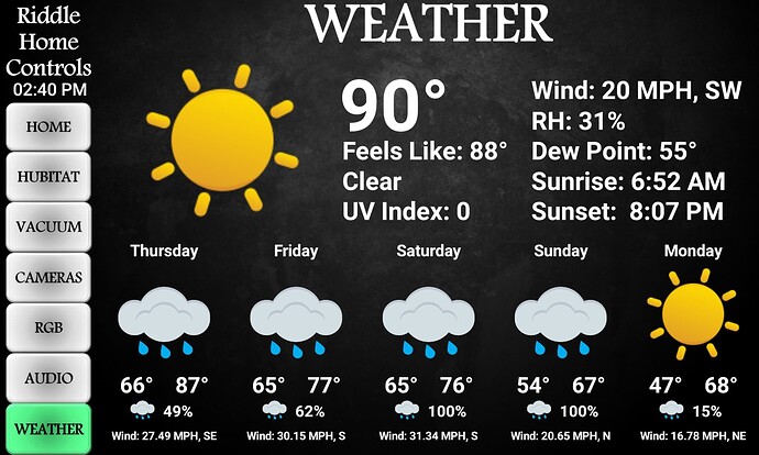
Last, a fairly standard weather page. See, it was warm yesterday! I still haven’t quite parsed how to update the current icon from a day icon to a night icon, but it doesn’t really bother me all that much.
That’s pretty much it. When I first started out, I was going to do some controls for the various audio/video locations I have around the house, but I’m just not a huge fan of tablet control for that. I’ve done it in the past with other programs, and I always end up back with a physical programmable remote. I guess I just like the tactile feel of a physical remote. Maybe one of these days I’ll tackle it as I have most of the hardware to make it work.
Again, thanks to everyone that has posted stuff here that helped drive my inspiration. I definitely “borrowed” the idea of the screens fading in/out from the main panel and it just makes the entire thing look wicked cool.

