Morning all… time to showcase my project ported to the iPhone. If you’re familiar with my project (featured in this showcase a couple of times) then you will recognise the layout and the general way that i’ve laid things out…my previous projects were my permanently mounted wall-tablets… and now is the time to showcase my iPhone layout that performs all of the same functionality but a bit more “armchair friendly”…
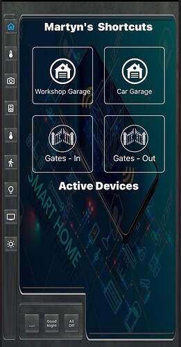
The home page has the same set of menu buttons on the left hand side… but for the iPhone it has some big and bold shortcuts for things I want to do rapidly when I pull my phone out of my pocket - such as opening the garage doors or opening the driveway gates…
The lower half ot the display is dedicated to “active devices”… this will show the tiles for devices that are switched on currently… it helps me keep tabs on what the daughter leaves switched on around the house!
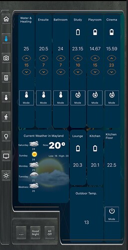
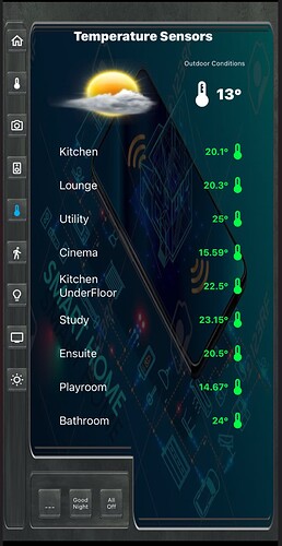
You may recognise the Temperatures page… its just resized and rescaled from the Tablet to the iPhone
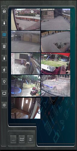
Same for the CCTV Page… just resized
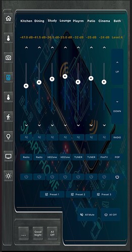
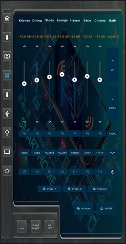
The House Audio Page is mostly the same as the wall tablets… but here we have the addition of Alexa controls on the right hand side for the bathrooms. These two bathrooms operate using an in-wall bluetooth amplifier that pairs with my Echo Show in the Bedroom… so here, the Bathroom Audio controls on the right are just scenes that tell Alexa to play music, set volume, and automatically connect to Bluetooth… You will note that there is no feedback from Alexa, so we only hve volume up and down, and no slider because we can’t know the current settings from Alexa.
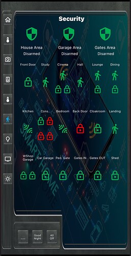
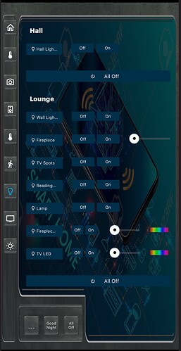
Again, if you are familiar with my Wall Mounted Tablet design then you will know that the next two tabs are House Plans… that means Temperature, security and Lighting control mapped onto an actual 3D map of the house… no point in doing that for an iPhone, so the layouts are much simplified…
This next page is a very long scrolling stack panel so I can scroll all the way down to find the room I want to control lights in…
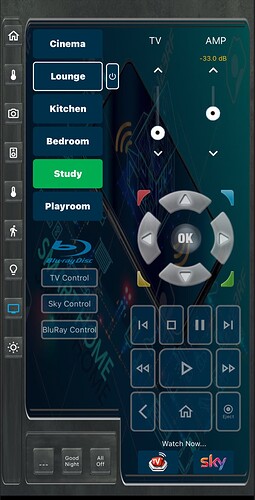
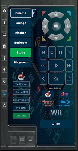
Now, these next layouts are the ones most used on the iPhone… these are the remote control features for the AV… FireTV, TV, BluRay and SkyTV Controls for each room. On the left we have the room selection, and on the right a scrolling panel that allows all of the buttons, controls and scenes to set things up for movie time. If this was an actual remote control it would be about 18" long… such is the greatness of the scrolling panel…
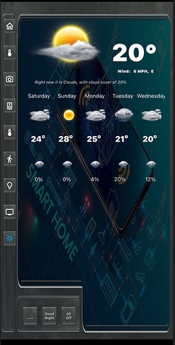
… and just for the heck of it, we finish up with a weather page…

