Help on custom dimmer light tile and icons

OK I’ve just done this not sure why? Doesn’t look any different when on.

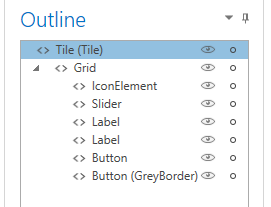
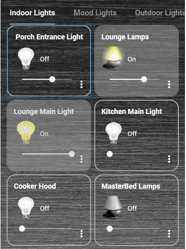
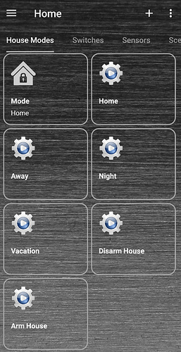
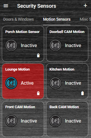
I think you mean the solid grey colour should only be within the border area. That would look nice but its not doing that as you can see:

image

Thanks.

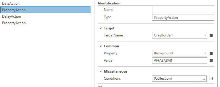
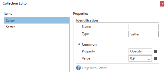
And I still can’t make it more opaque even with 0.9 also tried 0.1 doesn’t seem to make much different.

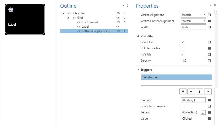
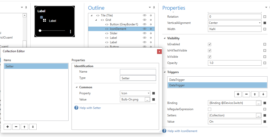
I’ve added a second setter on both the grid and on the border button and set it to 0.9

image

But it still looks like the above screen shot with pretty solid grey colour, when the light is on.

Cheers

If I delete the setter for the background for the grid.

It now looks like this when the light is on:

image

Which looks pretty good.

This looks better Opacity = 0.4

I don’t know what it didn’t change before when I tried 0.1 ?

Anyway seems to be working now.

image

Looking good!. yeah sorry… you’ll want to delete the datatrigger from the grid like you did and use the button as your border/background from here on.

If you want to remove the dark square shadow around the outside, remove the background of the grid.

You seem to have this down!! Now you have to remember what you did for the rest of your templates! :rofl:

1 Like

Yes I do, just been trying to figure out how to do that.

If I delete the grid’s background it looks like this, opacity = 0.5

image

And a different tile with a “Lamp” icon

image

Much better.

Damn I will have to edit all the tile templates now haha.

Thanks for your help.

It looks loads better with these new tiles:

Versus before:

:+1:
Looks like you are changing the opacity of the grid which effects everything in it including the icon. Try removing that. Put the opacity setter in the background button

I’ve just double checked.

There is no Opacity setter set for the grid in fact there are no setters at all.

On the border button in there I have the Opacity set to 0.5 and the background is set to AccentBrush9.

But yes the icons don’t look quite right, like they are behind the border button background and its Opacity.

I’ve just moved the IconElement to the top and the border button to the bottom like this:

image

This looks better now I think, the icon looks brighter no ?

image

Thanks

1 Like

Hi @jdamore

Can you help me with this Scene tile please ? I’m stuck again.

I would like the grey colour within the border area to appear upon clicking the tile, to run the Scenes and then to disappear again after I have clicked it. Bit like a touch feedback response.

On the border button, I removed the Device status binding and changed On to Clicked but I am obviously missing something else.

image

Many thanks

EDIT: I was testing in designer.

I’ve updated the app on my phone and it does very briefly fill in the border area when I click this scene tile.

Although I don’t think this is anything I have done and is just what the Home Remote app does when you click on something ?

This happens pretty fast, would be nice if it filled in the border area when pressed and kinda faded out the colour fill a bit more slowly after you have stopped pressing the tile.

Not sure what do you think ? I am sure there are better ways to do it than I know of.

Cheers.

@jdamore

Some new screen shots:

When the tiles are in the ON state the icons still look washed out and like they are behind the opaque border area colour.

The VPN switch its Opacity is 0.9 as a test.

The Canon Printer is Opacity 0.5

image

Any way to fix this ?

Run Scenes tiles.

image

@bill Did you look in to locking certain tiles down with a pin code or confirmation prompt, before they can be run ?

This is very handy in Imperihome to secure some actions and prevent you accidently pressing the wrong tile if its protected with a confirmation pop up box Yes / No did you really want to run it etc.

Thank you.

I’ll have to come back to this. I don’t have any scenes to test and I don’t want to make you the guinea pig. Like I mentioned in my PM, if you want to customize the look (and “feel”) of the button press, you’ll have to do it with Property Setters in Event Triggers.

For the tiles that become very greyed-out when enabled, move the button up the tree directly under <>Grid and see it that fixes everything

Also- how are you controlling the printer and why?! haha

1 Like

That seems to have fixed it moving the border button to the top underneath grid.

I thought I tried that before, but its working now.

Its just a ping sensor doesn’t actually do anything, just tells me if its “On” on not.

1 Like

ok… check it out. scene experiment.hrp (41.7 KB)
Playing around, I made two scene templates.
First one: When you press the tile, it will stay grey for 3 seconds and return to normal.

Second one: This one will flash the gray for several seconds and return to normal.

The EventTrigger are in the Tile
image

Just some ideas what you can do.

Note: the scene tiles have some sort of “mouse-over” highlight. Click the tile and move the mouse out of the way for the full effect. I linked the DataAction to the virtual devices so you wont be able to copy these directly.

1 Like

Hi

I am looking at your tile that flashes the colour of the border button on and off.

I see you have used an Event Trigger and Clicked is the event.

I would like to do something similar for a motion sensor tile to flash red, however I can’t figure it out.

For my motion sensor tile as is, its using a Data Trigger and a binding of @Device.Motion the event is “Active” to fire the trigger.

In the Actions, I can add a red background colour OK, but there is no DelayAction available, so I can only seem to have a static red background when the motion sensor trips.

I then tried to use an Event Trigger instead like you did, but cannot make that trigger fire when my motion sensor is tripped / Active.

Cheers

image

I know exactly what you are trying to do because I’ve tried to do the same. Unfortunately, it can’t be done using DataTrigger. DataTriggers only support property setters.

I would absolutely LOVE to have this ability so I could create short animations (short, meaning not looped) like flashing tiles. I’d like to do a huge pop-up that flashes red if a smoke, leak, or security issue is detected. This emergency pop-up would also have buttons like Turn On All Lights, Lock/Unlock Doors, ect…

The Scenes feature was recent added which will give you some actions from triggers but, this will not do what you’re looking for.

1 Like

Here is a related topic. Download the project the OP attached. While it does not do what you want to achieve it is pretty nice and may help you down the line.

2 Likes

eye candy :grin: :grin: :grin:

Can you tell me how you are getting the icon image change to happen when using the slider. Here is what I mean:
If the light is Off. I use the slider to set the light to anything but 100% or 0% the icon doesnt’t change. If I set the slider to turn the light on to 100% I get the On.png. If I set it to 0% then I get the off.png

When the light is OFF and I press the slider and move it up, whilst I have my finger still pressed down on the slider the off icon doesn’t change. Its only when I let go of the slider and when Home Remote app has polled the lights current level then the icon changes to the on icon.

I can let go of the slider at any level for example around the middle for 50% and the On icon is then displayed.

On the icon element on the tile there are two DataTriggers with the binding @Device.Switch

One DataTrigger has the value of “Off” and its Setter is Icon -> Bulb-Off.png

The other DataTrigger has a value of “On” and its Setter is Icon -> Bulb-On.png

Attached is my .xaml file take a look.

DimmerTile1Bulb.xaml (5.1 KB)