My very first page some questions

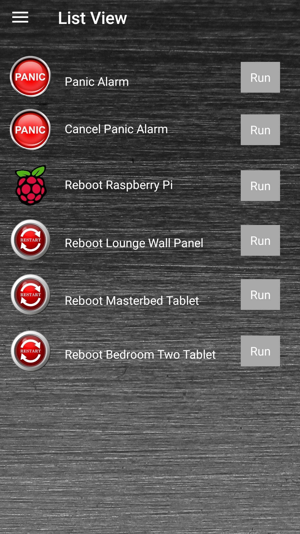
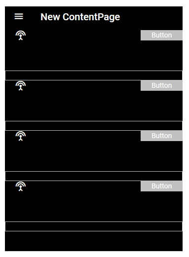
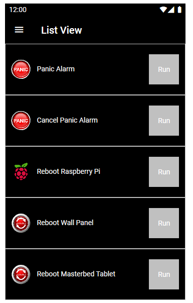
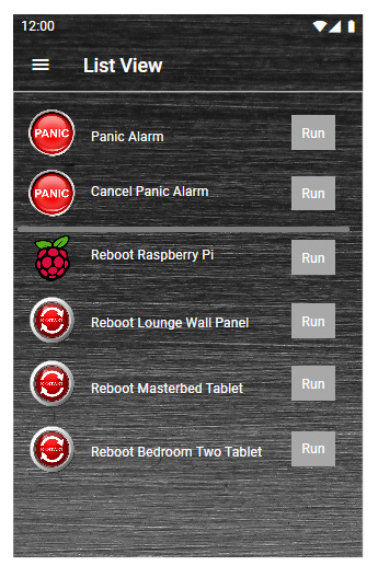
I wanted to create a List View page, rather than the Group Pages with Titles that I have been using so far.

I created a Grid and Rows, I seem to struggle in the Designer to get a uniform spacing between all elements on the page.

image

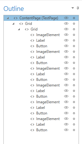
This doesn’t look to bad, but it took a lot of fiddling and moving elements around slightly to get things to line up and if you look at the Run buttons and the label texts, they are still not perfectly spaced with one and other. Is there an easier way regarding space elements?

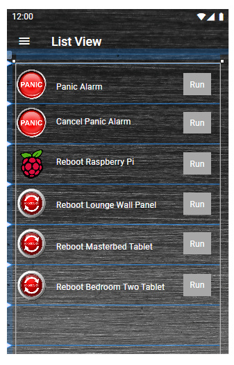
All these buttons run different Scenes in Vera.

In the Android app when I press the Run button it does give some indication that the button was pressed.

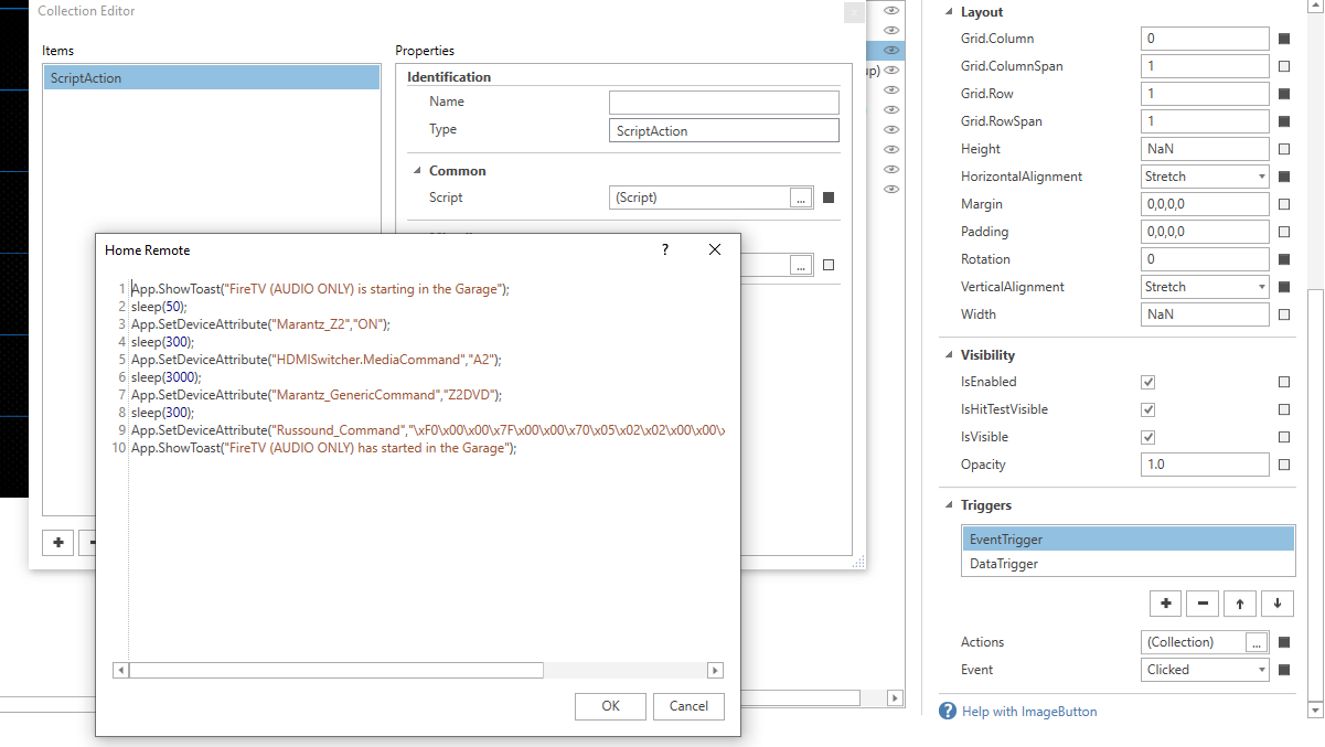
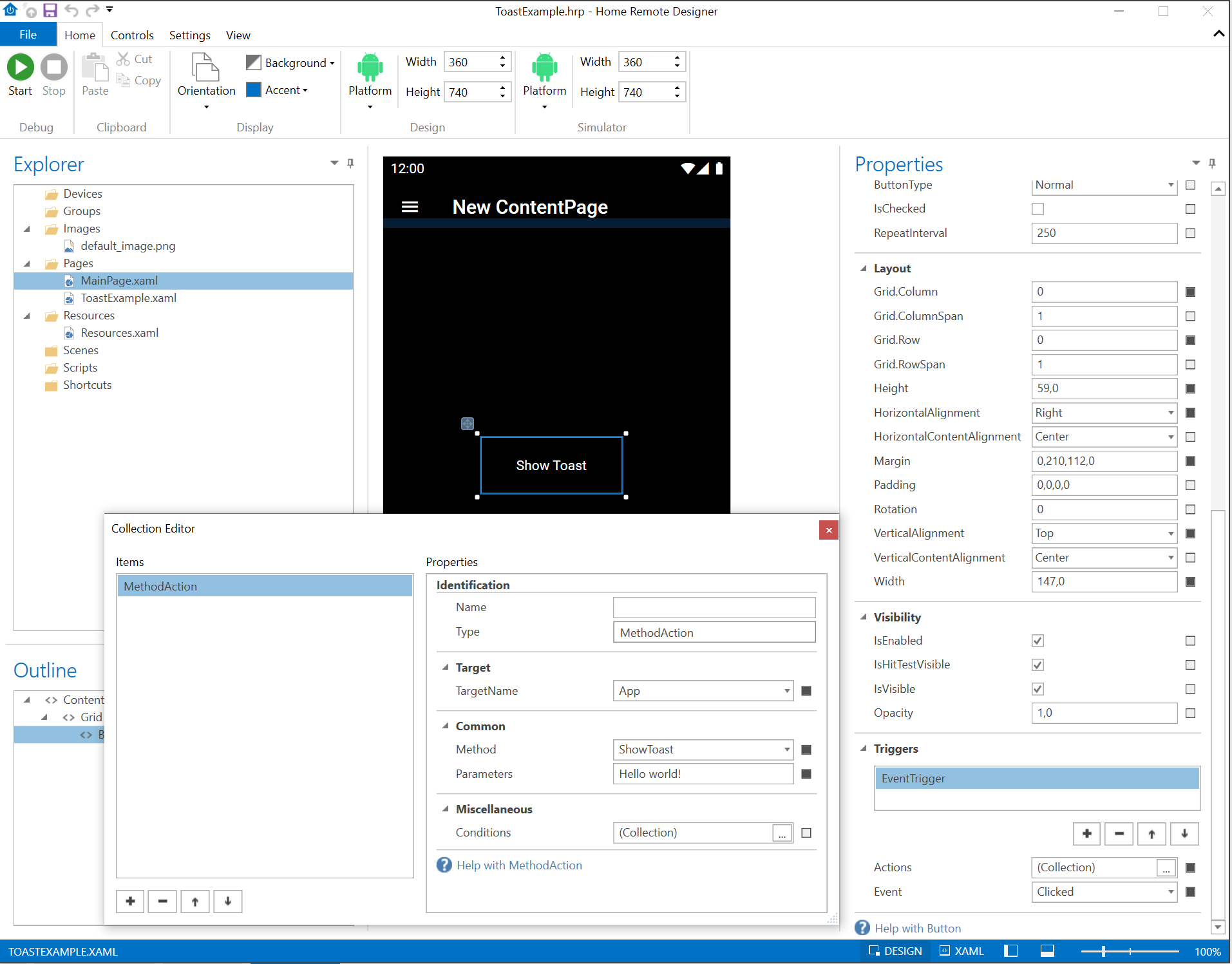
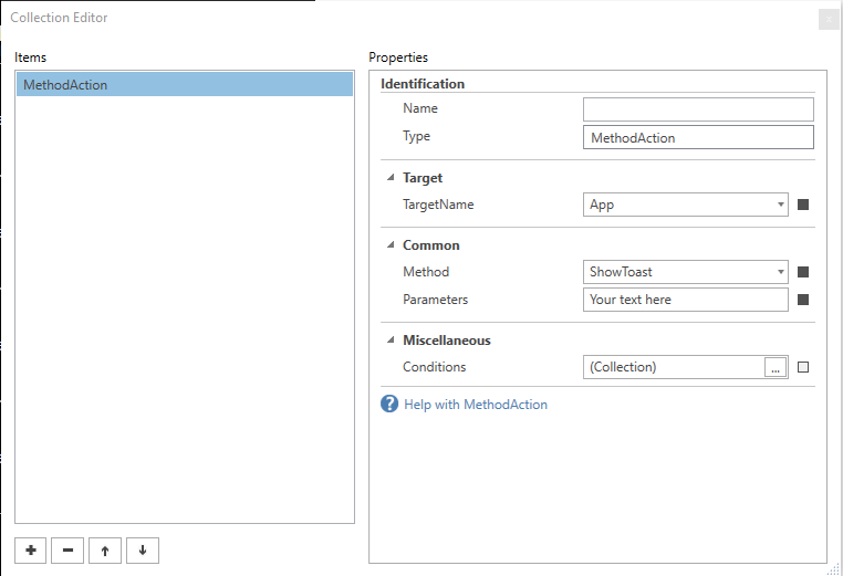
However is it possible to add a pop up banner at the bottom of the page that becomes visible when a Run button has been pressed and says:

Launching “Name of Vera Scene”

So for example if I pressed the Run button for the “Reboot Raspberry Pi” Vera scene, the pop up banner would say:

Launching “Reboot Raspberry Pi”

And then after a short while for the banner to disappear again.

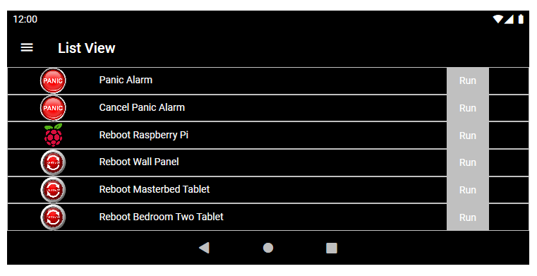
This is what happens in the List Views of the Imperihome app, which I am trying to replicate somewhat for less used Vera scenes and devices, so I can add them all on to one page.

Menus -

I was able to add my new page to the main menu at the left hand side of the app.

image

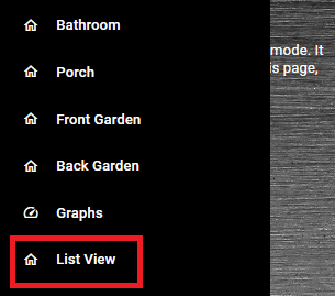
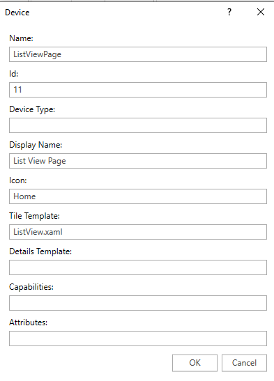
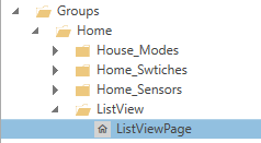
However what if I want to have a menu item for my new “List View” page within an existing Group?

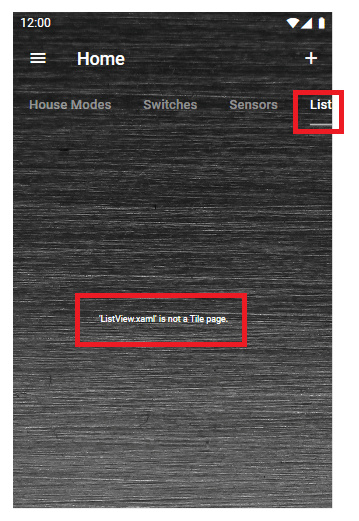
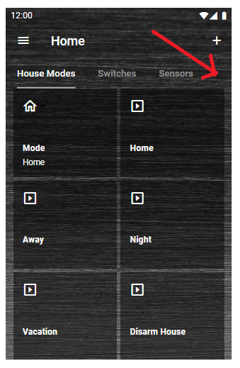
So for example say I want a “List View” menu item where the red arrow is pointing to:

Do I have to create a Plugin device that points to this new page or something? And then add that “Device” to my existing “Home” group.

How to add a dividing line? Like this:

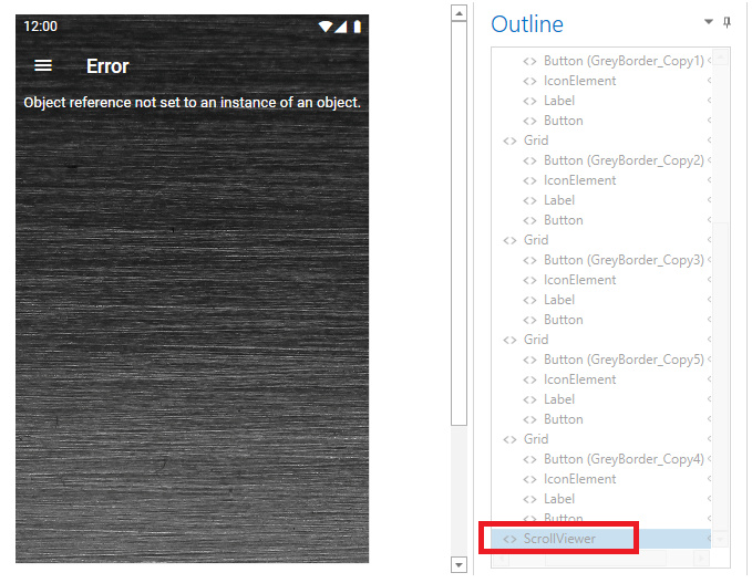
The grey line at the top of the page, I didn’t add the system seems to have done that itself and I can only see that line in the Designer when not in preview mode. I also can’t see that grey line actually in the Android app either, so seems to be a designer thing.

But if I wanted to add another dividing line, how might you do that ?

And this is how it looked in Imperhome List View much neater than I could make it look in Home Remote:

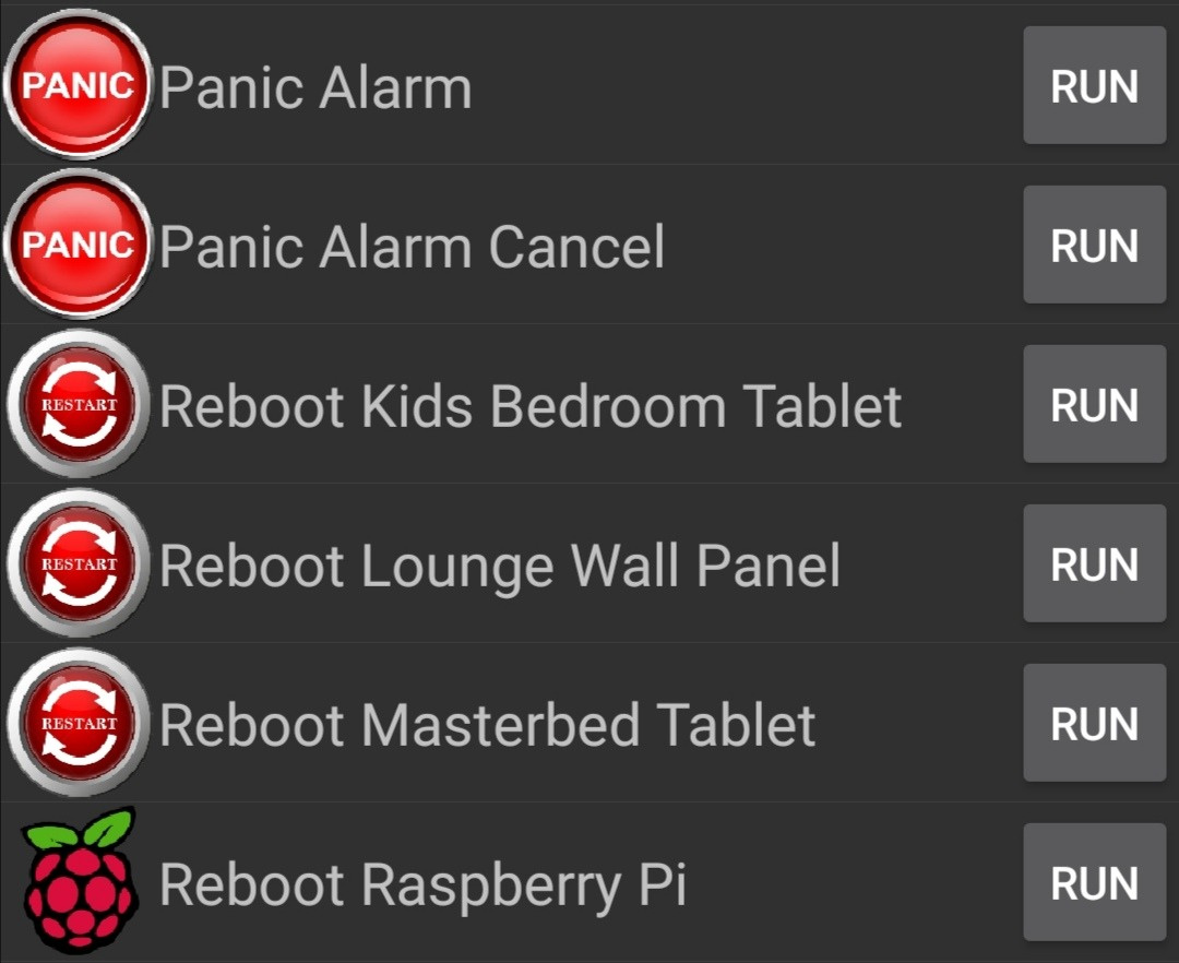
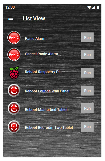
There also looks to be a very faint dividing line showing between each row.

Thank you.

Regarding adding a menu for this “List View” page on my existing “Home” Group.

I created a new plugin device like this:

I then created a new sub-group under “Home” and assigned my new plugin device:

image

However it doesn’t work as it says:

I just loaded the project on to my Android phone:

Portrait view:

Landscape view:

Seems I have some learning to do yet. :joy:

There are only 1 million billion different things you can do for UI tweaks. Sometimes playing around is the only way to really figure it out. Its like a mathematical art puzzle. For the layout maybe try breaking it up with different grids. The “art” is knowing when to leave the Layout properties at default and tweak other stuff like, for example, column/row sizes in a grid. Attached is an example with using more grids. Take a look and see if that puts you towards the direction you want. As for the grey bars, I added a button with a grey border… only thing is it completely surrounds it (on the sides too). CW_grid_suggestion.hrp (93.6 KB)
Now would be a good time for the experts to chime in on best layout practices :laughing:

You could do a Toast Message as your “pop up banner”. I’ve only used toast messages in scripts for my Event Triggers. Someone else would have to chime in on how to do Toast messages outside of a script. This is an example of my script for starting an activity in my garage (first line in the script is for the first toast message of it starting and the last line is for a second toast that it has started). There are more advanced pop ups you could do using a crap load of Property setters but, save that for when your functionality is 100% and you want some wow-factor.

This is just an FYI, but I generally discourage script use in XAML pages. Use a combination of the other actions instead. There will be times that scripts can’t be avoided but in the case you’ve shown, those can all be sent with DataAction, DelayAction, & MethodAction

Attached is an example showing how to send a Toast with a MethodAction.

ToastExample.hrp (3.5 KB)

Edit: you beat me to it… damn your fast
ahhh I just figured it out…

so in cw-kid’s case, for a toast, he would just add a MethodAction for his run button:

I guess I’ll start getting rid of those scripts

1 Like

Thank you very much for the grid file.

It looks great in the designer however when I run the emulator it changes to look like this:

I haven’t made any edits to it.

Thanks

OK this looks better after some tweaks.

CW_grid_suggestion2.hrp (244.1 KB)

^^^Looks good!

Opps!!! thats what happens if theres one object with a bad property. fixed: CW_grid_suggestion2.hrp (93.9 KB)

What did you just change to fix it with one change ?

When I was copying the grey outline to each grid. I had the row property wrong.

You may want to also make your vertical and horizontol alignment for the buttons to Center

1 Like

Its looking much better now using your suggested layout.

I now have 6 rows with a Run button for each and the page within the designer is now full.

Is it possible to add more rows / buttons and have a scroll bar down the side ?

Thank you

check this and see if it what you’re looking for…
https://www.youtube.com/watch?v=XbiX9HLFXDQ&list=PLKj9yrcK0qyAUxY-Vk-FO4bEkZIkNpoEV&index=11&ab_channel=SolutionCapacityLLC.

Also. if you want to add more rows in your grid, just add more RowDefinitions. Keep in mind this will compress the existing rows to fit in the new.

Thanks Bill that’s great ! I now have a message popping up after pressing each button.

For scrolling support you’ll need to add a Scroll Viewer to the root of the page. One problem you’ll run into is that you won’t be able to scroll during Design mode. So what you’ll have to do is temporarily increase your Design size so you can add what you need. When you run in the simulator and deploy to actual apps you will be able to scroll that content. I think that YouTube video Jeff shared was for v1, not by. Scrolling changed in v3. You now need a ScrollViewer.

1 Like

I just tried to add a ScrollViewer it goes to the bottom of the list however not the root of the page.

And I get an error now when playing the emulator.

Thanks

  1. Ctrl-X the current root Grid
  2. Add a new ScrollViewer
  3. CTRL-V your clipboard

That works its at the top now

image

Cheers

Thanks for your help guys ! Everything is working as I wanted now.

The only thing I cannot figure out is if its possible to have my new page displayed when I click on a Group - sub menu item, rather than having to select it from the main menu on the left.

Cheers.