
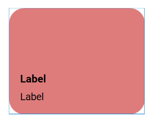
I was looking through the Showcase, most people have some sort of rounded tiles or buttons. Can you do that natively? Or are they images as backgrounds?
Buttons have a property “Corner radius”. Adjust the roundness by setting the radius value.
So, as I learn here, tiles are mostly custom jobs?
In regards to the nice setups in the Showcase.
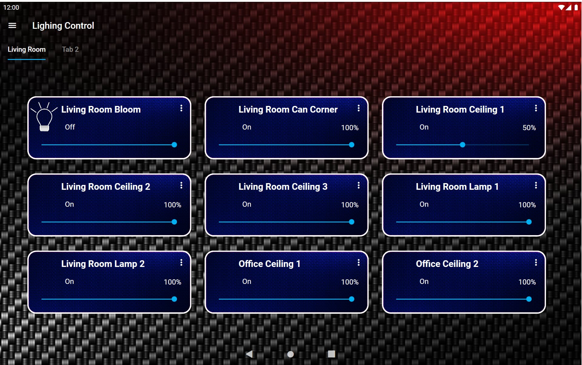
Looks cool! I’ve always been a fan of carbon fiber backgrounds.
For others who may be wondering this question…
1 Like
Hi guys, I followed this thread so I could also have a tile with rounded corners.
Everything worked well when I test the dashboard (by pressing play on the Designer). However, when I open the dashboard in my Android tablet, the behavior is different.
What is that the tile only works if I really click over the text in the tile, if I click on the colored empty area nothing happens or just the text disappear, the tile color doesnt change and, more importantly, the switch is not toggled. Any suggestion?
My custom tile template is basically using the Switch Template, the only change is that I added a button (keeping it at the back of everything. The DataTrigger event that was usually present on the Grid object (for toggling the color) I had to change to the button, so I could change the color of the right object).
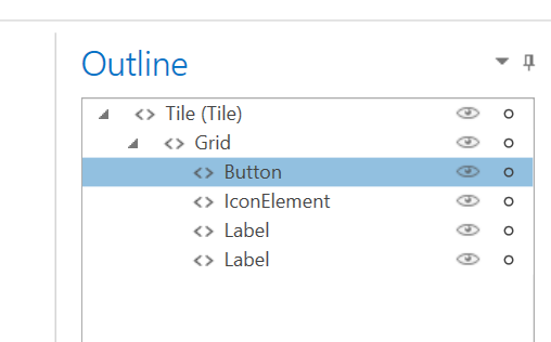
did you uncheck IsHitTestVisible on the button?
Yes. On the button component
Update: I think I solved it by changing the button type to toggle instead of Normal.