Can't understand new Height and Width settings

I wanted to upgrade my designer from 2.12.4 to a current version 3.6.0 to take advantage of a few new features (WOL on plug-ins), but I just can’t understand the switch from Screen Size + Aspect Ratio to Width + Height.

When I open my HRP file that looks and works great in 2.12.4 in the new 3.6.0 it looks like crap - much, much taller and wider than it ought to be. In 2.12.4 I set 5.5" screen size and 17.3:9 as the aspect ratio and in that config the designer and simulator work as expected. When I open in 3.6.0, it shows width of 1080 and height of 1920 - which is close to correct for a Galaxy S8. But not only are the icons on all my pages completely screwed up, but when I start the simulator, the design pages don’t look the what comes up in the simulator.

I tried completely re-doing my start page and using a grid to control how the page looks - but when I start the simulator the page seems to expand veritcally. If I can’t get the designer and simulator to look the same, I don’t see a point in continuing.

I really just needed to add in a new Blu-ray player in my home theater (Sony hopefully using the network control plug-in), but I am completely disheartened to find another painful learning curve just to go to version 3 of the designer.

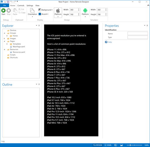
The Width & Height fields at the top are not your device’s pixel resolution. Those values are what Android calls “density-independent pixels (dp)” & what iOS calls “Points”. On the web it is sometimes referred to as “Viewport Size”.

https://developer.android.com/training/multiscreen/screendensities
https://developer.apple.com/library/archive/documentation/DeviceInformation/Reference/iOSDeviceCompatibility/Displays/Displays.html

For iOS, there is a table in the Designer you can use to find the point size for common iOS devices.

For Android, there are 2 websites I found that lists the DP pixel size for popular Android devices.

Here’s one. For this site the resolution you care about is in the “Width x Height dp” column (not the px column)

Here’s another one. The resolution on this site that you need to copy over is the “Viewport”.

In Google Play, there are also a few apps you can use that will detect your DP size. However there are several I found several that do not account for the Navigation Bar. The Designer wants the entire screen size, NavigationBar & StatusBar included. Here’s one I found that does calculate it correctly.

1 Like

Many thanks! This gets me most of the way back to working.

What I don’t understand is why a grid control set to height and width of “NaN” seems at run-time in the simulator to grow to something like 3,000 dp vertically. The only way I can work with a grid control seems to be manually setting a height?

The VerticalAlignment on the control is probably set to Stretch. Change it to Top, Center, or Bottom.

This post just saved me a lot of time as I update an old Nexus 5X and used the “Screen Size / Info / Dpi” app to get the exact 411 x 731 screen size I needed…